What's your interpretation? |
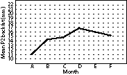 The line graph shows sample means of
P2 backfat measurements from a group
of sows at 35 days of gestation. Samples were collected in the herd on a monthly
basis. What additional information do
you need to interpret this graph? Is this
the best way to summarize the data?
What other information would make
these data more useful?
Data presentation for accurate interpretation
James Lowe, DVM
Carthage Veterinary Service Ltd, Carthage, Illinois.
Lowe J. Data presentation for accurate interpretation. J Swine Health Prod. 2003;11(1):50-51.
The question of data presentation and interpretation is very impor-tant and should not be taken lightly. There are many ways to collect, summarize, and display any set of data, but the methods that you choose will have a dramatic impact on the interpretation that you or your audience makes.
First, it is helpful to know how the samples were collected. They should be collected in a random manner that accounts for variation within the population (ie, all sows in the herd that are at day 35 of gestation) at each sample period. In addition, you would like to know if the samples are homogenous (ie, are all samples the same). These two facts can dramatically change your interpretation of the data. If the sample does not represent the population and if the individual samples are not homogenous, then it is impossible to know if there are any real differences between the sample values. This is the first standard that must be met for meaningful data interpretation.
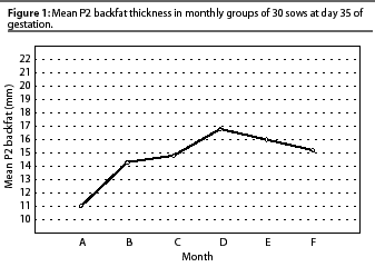
Figure 1 shows only the changes in sample means over a 6-month period. For any data set, two measures are necessary to make a meaningful interpretation: central tendency and dispersion. Measures of central tendency include mean, median, and mode. The mode is the most frequent value. The mean and median are the most useful measures of central tendency for most data sets. The mean used most commonly is the arithmetic mean, often referred to as the average. Adding all values in the data set together and dividing by the number of data points calculates the mean. The median is defined as the middle value: 50% of values are above the median and 50% are below it. Medians are useful when the data is not normally distributed or when there are values in the data set that lie far from the majority of the data points (outliers).
Measures of dispersion are important to understand the amount of variation in the sample and to estimate the amount of variation in the population. Measures of dispersion include standard deviation (SD), standard error of the mean (SEM), and quartile values. Discussion of the advantages and disadvantages of each of these measures is outside the scope of this article, but in general, SD or SEM are used when the best measure of central tendency is the mean. When the best measure of central tendency is the median, quartiles (25th and 75th) are used as the measure of dispersion.
The goal of collecting and summarizing production data is to understand the production process and allow intervention in the most effective manner. The data presented as means in Figure 1 may be summarized in three different ways: line graph of means with error bars equal to SD (Figure 2), line graph of means with error bars equal to SEM (Figure 3), and a box plot (Figure 4). The box plot displays the median, 25th and 75th quartiles, the expected range of the data, and outlier and extreme values in the sample data. The 25th and 75th quartile values are represented by the top and bottom of the box. The line inside the box represents the median. The lines perpendicular to the top and bottom of the box represent the expected range of the data. An asterisk represents an outlier value and an "O" represents an extreme outlier value.
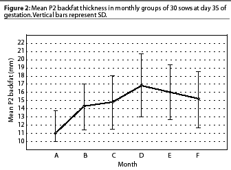
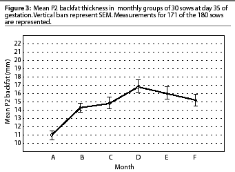
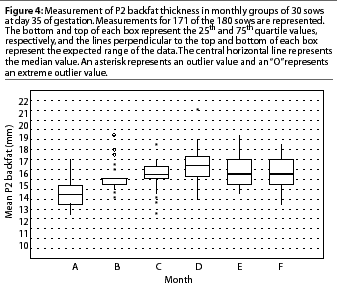
In this data set, the goals are to understand the amount of variation in sow backfat thickness, the percent of the sows in the acceptable range, and the change in the population over time. Because of their dispersion and the non-normal distribution, the most informative way to chart these data is the box plot. There is a great amount of variation in several months that is not displayed in Figure 3. In month C, there is a cluster of values around the median and mean, but a large number of values fall outside of that cluster. Figures 2 and 4 leave you with different impressions of the distribution of the sample. Each chart demonstrates that the backfat measurement is increasing over time.
It is important to summarize the information in any data set in a format that yields the most information and represents the data in an accurate manner. A measure of central tendency and measure of dispersion will help you understand differences in the population that require management attention.
